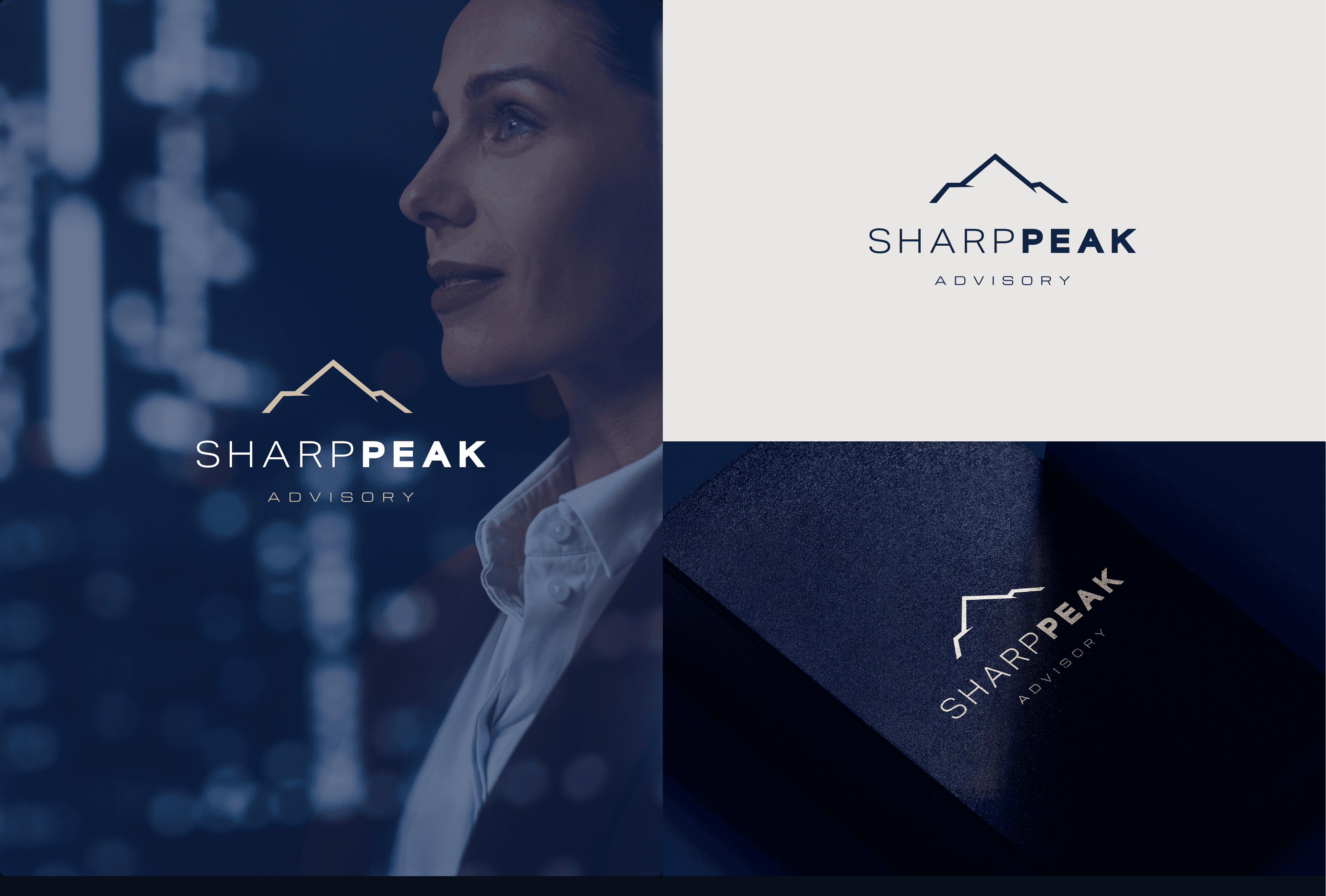
Sharp Peak Advisory

Sharp Peak Advisory Logo Design

Sharp Peak Advisory Logo Design

Sharp Peak Advisory Logo Design

Industry

Professional Services

Professional Services

Year

2026

2026

Services

Logo Design

Logo Design

Brief

Sharp Peak Advisory is a professional, trustworthy, and internationally-oriented brand positioned to serve business professionals aged 40–70. The brief called for a mark that feels established and larger than life, blending originality and simplicity to project a strong corporate presence. Four logo directions were explored for review.

Approach

Four distinct directions were developed for review: a mountain-silhouette mark, two interlocking 'S' and 'P' monogram treatments, and a traced-peak silhouette — each paired with its own colour story (deep blue/beige, regal purple/gold, dark blue/electric blue) for client feedback.

Outcome

Concept review is in progress with Sharp Peak Advisory; a final direction will be confirmed following client feedback.

Brand Colors

Primary Color#F2E1C7
Secondary Color#B2583E
Accent Color#374430
Neutral Color#1F1F1F

Tags

Branding, Logo Design, Professional Services, Concept Exploration

Typography

Heading Font

Fraunces

Brand systems with a softer edge

Body Font

Inter

A clear rhythm for thoughtful case study narratives, captions, and project context.

Clean geometric sans-serif wordmark, with a bold weight on "PEAK" for emphasis (final typeface pending selection).

Brand Colors

Primary Color#F2E1C7
Secondary Color#B2583E
Accent Color#374430
Neutral Color#1F1F1F

Typography

Heading Font

Fraunces

Brand systems with a softer edge

Body Font

Inter

A clear rhythm for thoughtful case study narratives, captions, and project context.

Clean geometric sans-serif wordmark, with a bold weight on "PEAK" for emphasis (final typeface pending selection).

Tags

Branding, Logo Design, Professional Services, Concept Exploration

Brand Colors

Primary Color#F2E1C7
Secondary Color#B2583E
Accent Color#374430
Neutral Color#1F1F1F

Typography

Heading Font

Fraunces

Brand systems with a softer edge

Body Font

Inter

A clear rhythm for thoughtful case study narratives, captions, and project context.

Clean geometric sans-serif wordmark, with a bold weight on "PEAK" for emphasis (final typeface pending selection).

Tags

Branding, Logo Design, Professional Services, Concept Exploration

Media Gallery

Media Gallery

Solara Studio brand identity image

Videos

Videos

Testimonial

No client testimonial yet — concepts are pending review and sign-off.

No client testimonial yet — concepts are pending review and sign-off.

No client testimonial yet — concepts are pending review and sign-off.