

For any design agency in Dubai, typography is the quiet variable that separates a website that commands trust from one that gets bounced in three seconds.
Answering the Question Fast: Why Typography Is a Deal‑Breaker for Any Design Agency in Dubai
A design agency in dubai doesn't just pick fonts-it uses typography to translate brand identity into digital experiences that feel premium, localized, and effortless to read. Whether the client is a DIFC financial services firm, a Jumeirah-based hospitality group, a Dubai Creek Harbour real estate developer, or a government entity, type choices carry the entire reading load of the website. Get them right, and visitors stay, trust, convert. Get them wrong, and even the most expensive campaign creative falls flat.
What makes Dubai different from London or New York is the audience composition in 2026. Your site is simultaneously read by Arabic-first government inspectors, English-speaking expat investors, Mandarin-speaking tourists, and long-term residents who code-switch between Arabic and English in the same browsing session. Bilingual typography decisions here are structurally more complex. You need two scripts, two reading directions, two sets of proportions-and both must feel equally intentional.
Here's what can go wrong when typography is treated as an afterthought: slow-to-read Arabic due to undersized fonts, mismatched Arabic and Latin font pairings that clash in weight and personality, weak visual hierarchy on mobile screens, poor contrast under the intense Gulf daylight, overloaded font files that tank page speed, and inconsistent numeral systems across dashboards.
Typography isn't a finishing touch. For Dubai brands, it's the structural layer that makes everything else-design, marketing, conversion-actually work.
The Role of a Design Agency in Dubai's Branding Ecosystem
A modern design agency operating in Dubai functions as far more than a logo shop. It's a hybrid of branding agency, digital marketing partner, and UI/UX studio-often handling everything from initial brand strategy to production-ready front-end code. Typography sits at the exact intersection of all three disciplines.
In dubai's competitive market, positioning a brand starts with strategic expertise that defines who the brand is and who it speaks to. That strategy gets expressed through a visual identity-logos, colors, photography style-and through the type system that governs how every word appears on screen. Then digital solutions bring it to life: websites, apps, dashboards, campaign landing pages. Typography is the thread that runs through all of these. A financial platform in DIFC can have a flawless UI, but if the type feels like a generic WordPress template, the perceived trustworthiness drops.
The connection between typography and business growth isn't abstract. Agencies track bounce rates, time-on-page, and conversion rates. When body text is too small, users leave. When heading hierarchy is unclear, users don't scroll. When Arabic and English feel like they were designed by two different teams, the brand message fractures. Poor typography can undermine even the strongest digital marketing campaigns, quietly eroding the ROI of ad spend and content investment.
Serious brands now expect comprehensive services: a full brand identity system that includes fonts, type scales, spacing rules, and usage guidelines-documented thoroughly enough that an in-house team or a third-party developer can implement them faithfully. This is what separates a strategic partner from a vendor who delivers a PDF of logo files and disappears. The expectation for any credible design agency is end-to-end ownership, from creative concepts through to the CSS that renders the final typographic choices in a browser.
Dubai's Visual Culture: How the City Shapes Web Typography
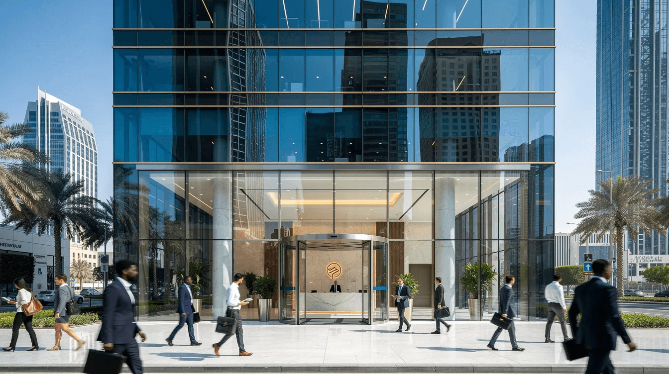
Drive down Sheikh Zayed Road after sunset and you're surrounded by LED billboards the size of buildings, the Burj Khalifa's programmatic light show, and the minimal luxury retail facades of Dubai Mall where a single word in a serif font occupies an entire storefront. Walk through Al Fahidi and you encounter Arabic calligraphy-Naskh and Kufic scripts-carved into walls and woven into public art. This is the typographic environment Dubai brands exist inside. A creative design agency working here has to read this visual culture and translate it into digital experiences that feel locally authentic while remaining globally fluent.
Luxury hospitality brands like those operating along Jumeirah Beach or on Palm Jumeirah tend toward refined serifs, generous white space, and restrained uppercase treatments that echo the quietness of high-end physical spaces. Government portals-DubaiNow, RTA, Dubai Municipality-lean into geometric sans-serifs that prioritize clarity, accessibility, and bilingual consistency. Meanwhile, tech and venture brands clustered in DIFC and Dubai Design District (d3) often pull from the same typographic playbook as Silicon Valley: clean humanist sans-serifs, tight heading hierarchies, and dark-mode-friendly palettes.
The tension in Dubai's web typography sits between spectacle and restraint. The city is inherently maximalist-gold leaf, soaring architecture, immersive experiences. But the 2024–2026 design trend across the Middle East has pushed toward minimalist, high-performance interfaces. A creative partner working in this market needs to know when each mode is appropriate, and typography is where that decision becomes most visible.
Understanding local culture isn't optional. The way Arabic calligraphy evokes heritage and authority, the way certain serif families signal luxury, the way a geometric sans communicates innovation-these associations are learned, contextual, and specific to this region. Ignoring them produces websites that look imported rather than intentional.
Brand Identity Starts With Type: How Fonts Define a Dubai Brand Online
For a branding agency in dubai, typography is often the first and most persistent expression of brand identity. A logo gets seen in a corner. A color palette provides atmosphere. But type carries the actual words a customer reads-on the website, in the mobile app, across pitch decks, on signage, in social media templates. It's the voice of the brand made visible.
Different font categories map directly to Dubai brand archetypes. Geometric sans-serifs (think clean, structured letterforms with uniform stroke widths) communicate precision, modernity, and trustworthiness-ideal for fintech platforms, SaaS products, and government services. Serif typefaces, with their contrast and historical weight, signal luxury, heritage, and editorial authority-well suited for hospitality groups, high-end real estate, and cultural institutions. Humanist sans-serifs, which carry the warmth of handwritten forms, work for healthcare, education, and community-facing organizations.
Consider a 2025 DIFC-based fintech that had launched with default system fonts. Users completed the onboarding flow, but UX research revealed low perceived trust-the interface felt generic. After the agency introduced a custom geometric bilingual Arabic-Latin family with carefully matched weights, trust perception scores in usability studies improved. The font didn't change the functionality. It changed how people felt about the functionality.
Or take a boutique desert resort near Al Qudra. Their original website used a sans-serif at tight line spacing. The storytelling pages-descriptions of desert expeditions, stargazing experiences-felt compressed and clinical. Shifting to a high-contrast serif with warmer line spacing made the content feel immersive. Time on those pages increased.
A design company builds a type system by defining heading styles (H1 through H6), subheading treatments, body copy specs, captions, and UI labels-then stress-testing each at common breakpoints: 360px for phones, 768px for tablets, 1440px for desktop monitors. This system becomes a living document inside brand guidelines that travels with the brand across every touchpoint. Without it, every new page or campaign risks typographic drift, and the brand slowly loses coherence.
Arabic + English: Bilingual Typography Challenges Only a Dubai Design Agency Truly Feels
Bilingual typography in Dubai isn't about translating content and hoping the layout holds. Arabic reads right-to-left. English reads left-to-right. That difference cascades through every element: navigation order, hero image orientation, form field alignment, progress bar direction, and where the user's eye lands first on a page. Agencies must plan for RTL and LTR layouts from the wireframe stage, not retrofit them after launch.
One of the most common failures is visual weight mismatch. Arabic text set at the same pixel size as English often looks smaller and lighter, because Arabic letterforms have different proportions, ascenders, and descenders. A competent design agency in Dubai compensates for this-sometimes by increasing Arabic body text by 15–20% in size, sometimes by selecting Arabic typefaces with heavier stroke weights, sometimes both. A usability study conducted through BUiD found that 63.33% of Arabic readers considered website font sizes "small," compared to only 10% of English readers reviewing the same sites. The data is clear: Arabic type needs more room.
Government service portals present one challenge-they must serve Arabic-first users without making the English experience feel like an afterthought. E-commerce sites catering to tourists face the opposite: English-first design that still meets legal and cultural obligations for Arabic support. In both cases, you're testing mirrored layouts, checking numeral systems (Western Arabic numerals vs. Arabic-Indic numerals), verifying diacritical mark rendering, and ensuring the brand voice feels consistent across both scripts.
Technical constraints multiply the difficulty. True bilingual font families-where Arabic and Latin glyphs share the same design DNA-are fewer than their Latin-only equivalents. Variable fonts with full Arabic support remain uncommon. Loading separate Arabic and Latin font families means more HTTP requests, larger payloads, and greater risk of layout shifts. Fallback strategies matter: if an Arabic glyph subset is missing, what system font takes over, and does it break the design?
These aren't edge cases. They are the daily reality for any design agency doing serious work in the UAE. Agencies that treat Arabic typography as a secondary concern produce websites that feel half-finished to half the audience.
Typography Systems for Full Service Design: From Logo to Webflow or WordPress
Full service design in 2026 means more than delivering a logo file. It means building a complete system: brand identity, UI/UX design, Webflow or WordPress front-end implementation, and often a documented design system that in-house teams can maintain. Typography is the structural backbone of that entire chain.
The cascade starts at logo and wordmark design. When a creative design agency selects or commissions a typeface for a wordmark, that choice constrains-or empowers-every typographic decision downstream. The wordmark font influences heading treatments, which influence body copy pairings, which influence button labels, form fields, and data-heavy components like pricing tables and dashboards. If the logo font is an ornate display face with no corresponding text weights, the agency will need a secondary family for UI-and the pairing must feel intentional, not bolted on.
A documented type system includes a base pixel size (commonly 16px for English, sometimes 18px or higher for Arabic), a modular scale (the Dubai Design System uses a Minor Third ratio of 1.2), defined weight ranges (Regular, Semibold, Bold at minimum), line-height values for each text style, letter-spacing rules, and clear do/don't examples in both English and Arabic. These brand guidelines prevent the slow erosion of typographic quality that happens when multiple designers and developers touch the same codebase over months.
Consider a bank or large real estate portal where the original logo design used a distinctive serif. When the brand expanded into digital dashboards-dense with tables, numbers, and interactive controls-that serif became illegible at small sizes. The agency had to rethink the type system: introducing a complementary sans-serif for UI components while keeping the serif for marketing pages, creating clear rules for when each applies.
This is why web design services and web development need to sit under the same roof. When design and development teams operate separately, the type system degrades at handover. When one dedicated team owns the process from Figma to production, typography stays faithful to the brand vision.
Performance Matters: Fast-Loading Fonts for Dubai's Mobile‑First Users
Over 70% of web traffic in Dubai's retail and services sectors comes from mobile devices. Users are typically on 4G or 5G, but congested evening networks-especially during Ramadan, DSF, or major events-can slow things down. Typography choices directly affect how fast a page renders, and in a market where mobile app development and mobile web experiences compete for attention, speed matters.
Font performance starts with format selection. WOFF2 is the current standard-significantly smaller than older formats like TTF or OTF. Beyond format, agencies limit the number of font weights and styles loaded. A common mistake is loading six weights of an Arabic family and five of a Latin family, resulting in 11 font files before a single word appears. Smart subsetting-stripping unused glyphs from character sets-reduces file sizes further. Variable fonts, when available with Arabic support, allow multiple weights from a single file, cutting requests dramatically.
Poor font decisions create visible problems. Flash of invisible text (FOIT) leaves users staring at blank blocks while fonts download. Flash of unstyled text (FOUT) shows a jarring system font before the brand font loads. Both cause Cumulative Layout Shift (CLS), a Core Web Vital that directly impacts SEO rankings. Slow First Contentful Paint means users on campaign landing pages-where every second of paid media spend counts-may bounce before the headline even renders.
This connects typography to digital marketing ROI. Ad landing pages for Google Ads, Meta, or TikTok campaigns must load fast. If your font strategy adds 1.5 seconds to load time, you're paying for clicks that never convert. A design agency that treats font loading as a revenue concern-not just an aesthetic preference-protects campaign budgets and supports lead generation performance.
Best practice: limit your site to two font families (one Arabic, one Latin-or one bilingual family), three weights maximum, served in WOFF2 format with preloaded critical subsets.
Typography and Conversion: How Design Agencies Use Type to Increase Leads and Sales
Typography is one of the most underleveraged conversion levers available to a design agency. Small adjustments-font size, weight, line spacing, button label styling-can influence whether a visitor completes a form, clicks a CTA, or abandons the page.
Consider a property inquiry form for a Dubai Marina development. The original design used 13px labels and 14px input text, matching the developer's print-influenced brand guidelines. On mobile, the text was difficult to read, and older users (a significant portion of real estate buyers) struggled with the compact form fields. Increasing body size to 16px, improving label contrast, and adding more vertical spacing between fields lifted form submissions measurably. The target audience hadn't changed. The offering hadn't changed. The type had.
On a B2B lead generation page for a logistics firm in JAFZA, the agency found through heatmap analysis that users were dropping off mid-page. The culprit: a flat typographic hierarchy where H2 headings were barely distinguishable from body copy. After increasing heading weight and size-creating a visible "staircase" of hierarchy-scroll depth improved and CTA clicks in the lower section increased.
Eye-tracking research with UAE audiences reveals differences in how Arabic and English content gets scanned. Arabic readers tend to start from the right side, and their scan patterns differ from the F-pattern commonly assumed in Western UX. This means CTA placement, button label casing (ALL CAPS can feel aggressive in English and is structurally inappropriate for Arabic), and typographic emphasis must be calibrated for each language.
These adjustments support cost effective outcomes by tying small, testable changes to measurable lifts in campaign performance. When an agency can show that a font-size change reduced cost per lead by even 8–12%, typography stops being a subjective conversation and becomes a budget conversation. Businesses seeking higher returns from existing traffic should treat type as seriously as they treat ad targeting.
Luxury, Government, Startup: Sector-Specific Typography Playbooks in Dubai
Typography strategies in Dubai vary dramatically by sector. A one-size-fits-all font choice fails because the city's brand ecosystem is too diverse-a hospitality brand and a government portal speak to fundamentally different audiences with different expectations.
Luxury hospitality and retail brands-think City Walk boutiques, Bluewaters Island dining concepts, or five-star hotel groups-favor serif typefaces or elegant thin-weight sans-serifs. Uppercase letterspacing is common in English headings to signal exclusivity. Line heights are generous. White space is treated as a design element, not wasted real estate. These brands need high quality visuals where typography reinforces the physical experience of premium spaces and services.
Government and semi-government entities (RTA, Dubai Municipality, DEWA, Smart Dubai) prioritize clarity, accessibility, and bilingual consistency above all else. The Dubai Design System, which serves as the official typographic standard for government digital services, recommends the "Dubai" font family for both Arabic and English and enforces a structured type scale, clear heading hierarchy, and contrast ratios of 4.5:1 for body text aligned with WCAG 2.1. Typography here must work for diverse audiences: elderly residents, blue-collar workers, tourists, and executives.
High-growth startups and SaaS companies based in Dubai Internet City, in5, or DIFC tend toward the same sans-serif families popular in global tech: clean, geometric, optimized for screen rendering. But the smart ones differentiate through creative solutions tailored to regional needs-pairing a global UI font with a distinctive Arabic heading family, or using a variable font that scales from marketing site to product dashboard without visual friction.
Fintech and Islamic banking present specific typography constraints. Financial interfaces demand numeric clarity-currency formatting, transaction tables, account balances-where font choices affect error rates. Islamic banking products often serve an older demographic that values traditional Arabic script aesthetics alongside modern interface expectations. The typography must feel both compliant and approachable, delivering information across various industries without compromising quality or accessibility.
Minimalism vs Maximalism: Current Web Typography Trends in the UAE
The dominant web typography trend across the UAE in 2024–2026 is unmistakably minimalist: larger white space, fewer font families, generous line heights, restrained color palettes, and type that breathes. This aesthetic dominates long-term corporate sites, SaaS platforms, fintech interfaces, and healthcare portals. It reflects a global shift, but it resonates particularly in the Gulf, where the contrast between minimalist digital design and the maximalist physical environment creates a deliberate sense of calm and focus.
"Dubai maximalism" hasn't disappeared. Campaign microsites for events like Dubai Shopping Festival, F&B launches in DIFC, entertainment venues, and cultural institutions still employ large hero headlines, animated type, gradients, overlapping Arabic and Latin display fonts, and kinetic scroll effects. These are designed for impact and short lifespan-they don't need to age gracefully, they need to stop the thumb.
A design agency in Dubai recommends one or the other based on context. For a corporate site that needs to serve diverse industries and last 2–3 years before a redesign, minimalist typography ages better, supports SEO, and scales cleanly across devices. For a six-week campaign promoting a new restaurant in Business Bay, maximalist type creates the emotional punch that drives reservations. The mistake is applying campaign aesthetics to permanent brand properties, or vice versa.
The accessibility argument also favors minimalism for long-term assets. Simpler type systems with fewer styles and higher contrast are easier to maintain, easier to audit for compliance, and perform better for AI search visibility. As brands think beyond traditional search and toward AI-generated answers-where clean, structured content wins-the case for restrained, readable typography only strengthens.
The brands that get this balance right use their minimalist type system as the foundation and layer maximalist moments on top for campaigns, creating a design led approach that's both consistent and flexible.
Accessibility and Legibility: Designing for All in a Fast-Growing City
Dubai's population spans dozens of nationalities, age groups, literacy levels, and device types. Accessibility in typography isn't a regulatory checkbox-it's a direct reflection of whether a brand respects its full audience.
Best practices start with contrast. The Dubai Design System mandates a 4.5:1 contrast ratio for body text, aligning with WCAG 2.1 standards. In practical terms, this means avoiding light gray text on white backgrounds-a common aesthetic choice in minimalist design that fails users in bright environments. Gulf daylight is intense. Many users browse outdoors or in sunlit offices. If your contrast ratios barely pass on a calibrated monitor, they'll fail in real conditions.
Minimum font sizes matter, particularly for Arabic. As the BUiD usability study demonstrated, Arabic text is consistently perceived as too small on websites when set at the same size as English. Design services for accessible sites often set Arabic body text at 17–19px (compared to 16px English), with line-height values of 1.6–1.8 to give diacritical marks room to render clearly. On lower-cost Android devices-common across the broader GCC region-font hinting (the instructions that control how glyphs render at small sizes) becomes critical for Arabic legibility.
Government digital guidelines in the UAE push toward accessible design for public-facing services. Healthcare portals used by older residents, transportation apps used by workers with varying literacy, banking interfaces used by people managing finances in a second language-these all demand typography that reduces cognitive load rather than adding to it.
An accessible type system must cover: minimum size thresholds for both scripts, contrast ratios tested in real lighting, line-height and spacing adequate for Arabic diacritics, font hinting quality on common devices, and scalable text that responds to user browser settings. In a city built on service excellence, inaccessible type feels fundamentally off-brand.
Choosing the Right Typefaces: Global Fonts vs Regionally Native Families
Global "design darling" fonts-Inter, Roboto, SF Pro-are popular for good reason: they're well-engineered, freely available, and render beautifully on screens. But they were designed primarily for Latin scripts. Their Arabic equivalents (if they exist) are often secondary additions with less typographic refinement.
Over 113,700 websites in the UAE use the Google Fonts API, reflecting heavy reliance on global font delivery. Google's Arabic-compatible families-Cairo, Tajawal, Noto Sans Arabic-are solid workhorses for projects with tight budgets. But for brands where typography is a competitive differentiator, a branding agency in dubai typically looks beyond free options.
Regionally developed and commercially licensed Arabic typefaces offer better kerning, more weights, and design sensibilities tuned to Arabic readers. Art Dubai's brand guidelines, for example, pair 29LT Bukra and Greta Text Arabic with Latin counterparts to create distinct primary and secondary typographic voices. Emirates NBD's brand system specifies IBM Plex Sans for English alongside dedicated Arabic families with explicitly defined hierarchies.
When evaluating typefaces, a design agency considers: Arabic glyph quality and completeness, kerning and spacing at small sizes, number of available weights, licensing terms for high-traffic commercial websites, variable font availability, and how the typeface aligns with the brand personality. A geometric sans that feels "innovation-forward" in Latin must have an Arabic counterpart that reads with the same energy-not one that looks borrowed from a government form.
The selection process should be visual, not theoretical. Agencies prototype 2–3 paired font options in realistic page layouts-hero sections, body paragraphs, mobile card views, bilingual navigation-before making a final recommendation. Seeing "Heading + Body + Arabic + English" in a real layout reveals problems that a font specimen page never will.
A warning about free, poorly maintained Arabic fonts: they may look acceptable in Figma but break at production scale. Missing glyphs, inconsistent metrics between weights, and poor hinting on Android devices create graphic design inconsistencies that erode brand credibility. The upfront cost of a quality Arabic font license is almost always cheaper than the downstream fixes required when a cheap font fails.
Type Hierarchy and Layout: Guiding the Eye on Busy Dubai Websites
Type hierarchy is the system of visual contrast-through size, weight, spacing, and color-that tells a reader what to look at first, second, and third. On Dubai websites, where pages are often long-scrolling and information-dense, clear hierarchy is the difference between a page that guides and one that overwhelms.
The basics: H1 should be unmistakably the largest and boldest element on any page. H2 marks major sections. H3 introduces sub-topics. Body text is comfortable and even. Captions and meta text recede. The gaps between these levels should be consistent and clearly visible-not just 2px differences that disappear on a phone screen. A creative design agency uses a defined type scale (like the 1.2 Minor Third recommended by the Dubai Design System) to maintain proportional relationships between heading levels.
Different page types demand different hierarchy strategies. A single-focus landing page-for an Expo-style event or a product launch-needs a dominant H1, a supporting subtitle, and then body content that drives toward a single CTA. The hierarchy is steep and focused. A multi-service corporate site for a holding company needs a flatter hierarchy with many equally weighted sections, clear navigation labels, and consistent card layouts that let users compare services. Content-heavy resources-blogs, knowledge hubs, research portals-need a hierarchy that supports long-form reading: clear H2 anchors, scannable H3 sub-sections, and body text sized for sustained attention.
Layout components reinforce hierarchy. Card-based grids for property listings use type size and weight to distinguish price, title, and location. Multi-column mega menus use hierarchy to separate categories from sub-items. Mobile-optimized accordions for FAQs on bilingual sites must maintain hierarchy even when content is collapsed.
In a city with constant visual stimuli-from Sheikh Zayed Road billboards to Instagram feeds-web typography must reduce cognitive effort. Users arriving on your page have already processed thousands of visual messages that day. If your hierarchy makes them work to find what matters, they'll leave for a competitor whose page makes it obvious.
Typography in UI Components: Forms, Tables, and Dashboards for Dubai Businesses
Marketing pages get all the typographic attention. But for Dubai businesses running property management systems, logistics dashboards, booking engines, and financial admin panels, UI component typography is where users spend hours of their working day.
UI components need different type rules than marketing pages. Line heights are tighter to fit more data on screen. Font sizes are more compact-but must remain readable over long workdays. Weight variation is used sparingly to distinguish labels from values, active states from inactive ones. The goal is density without claustrophobia.
Consider a property management dashboard for a Dubai Marina portfolio. The interface displays unit numbers, tenant names, lease dates, payment statuses, and maintenance requests in a dense table. If the type is too small, property managers make errors. If line-heights are too generous, critical data gets pushed below the fold and requires excessive scrolling. The typography needs to be functional, not decorative-but it still needs to feel like part of the same brand that appears on the marketing website.
A logistics tracking dashboard for a Jebel Ali operation presents similar challenges at a different scale. Shipment IDs, container numbers, ETAs, customs statuses-these are scanned rapidly by users who process hundreds of entries per shift. Monospaced numerals (where every digit occupies the same width) become essential so that columns of numbers align perfectly. Sans-serif fonts with clear distinction between similar characters (1/l/I, 0/O) reduce misread rates.
Numeric typography deserves specific attention in Dubai's business environment. Invoices, prices, and dates appear across every interface. Arabic and Latin numerals must be handled consistently-mixing Arabic-Indic numerals (٠١٢٣) with Western Arabic numerals (0123) within the same interface confuses users. The type system should specify which numeral set appears in which context and enforce it through design tokens.
A graphic design agency that only thinks about marketing aesthetics will produce dashboards that look pretty in a portfolio but create friction in daily use. Productivity and error rates are directly affected by typographic quality in UI components. For businesses across various sectors, these interfaces are where brand typography proves its functional value.
Case Style, Microcopy, and Tone: How Words Look, Not Just What They Say
ALL CAPS, Title Case, sentence case-these aren't just grammatical conventions. They're visual choices that change how a Dubai brand's voice is perceived. A creative design agency standardizes these treatments across every touchpoint because inconsistency in case style creates a subtle but persistent feeling of disorder.
Luxury brands in Dubai have been shifting from ALL CAPS navigation labels-once a hallmark of premium digital design-to Title Case or even sentence case for a softer, more contemporary feel. ALL CAPS can feel authoritative in English, but it's structurally irrelevant in Arabic script (Arabic has no uppercase/lowercase distinction), creating an asymmetry in bilingual layouts. Sentence case, used consistently, feels approachable in both languages.
Government services have moved toward simplified microcopy-shorter button labels, clearer error messages, plain language in both Arabic and English. Instead of "SUBMIT YOUR APPLICATION FOR REVIEW," a modern government portal might read "Submit application." The typography supports this simplification: clean sans-serifs at comfortable sizes, consistent padding, and predictable placement.
Tonal consistency in microcopy-button labels, tooltips, validation messages, empty states-is now part of comprehensive full service design packages. It's not an afterthought handled by developers writing placeholder text. When a branding agency in Dubai documents a type system, it includes microcopy guidelines: preferred case style for navigation, buttons, headings, and body; tone guidance for error states ("Something went wrong" vs "Error 403"); and bilingual equivalence rules ensuring the Arabic microcopy carries the same emotional register as the English.
Typography, SEO, and AI Search Visibility for Dubai Brands
Typography and content structure are more connected to search visibility than most brands realize. Proper use of heading tags (H1 through H6), readable formatting, and logical content blocks doesn't just help human readers-it signals relevance and structure to search engine crawlers and AI systems.
A design agency in Dubai building websites in 2026 must consider both traditional SEO and the emerging requirements of AI search tools like ChatGPT, Perplexity, and Gemini. These systems parse page content to generate answers, and they favor well-structured, clearly hierarchical text. A page with a single H1, logically ordered H2s, scannable H3 sub-sections, and concise body paragraphs is more likely to be surfaced as a source for AI-generated responses than a page where all text is styled visually but lacks semantic heading structure.
This means typography decisions have SEO consequences. When a designer uses an H2 tag for a decorative subtitle (purely for visual size) rather than for a genuine content section, they're muddying the semantic structure. When body text is broken into 300-word paragraphs without subheadings, crawlers and AI parsers struggle to extract discrete answers. When emphasis is applied through font weight rather than semantic tags, machines miss the signals.
A Dubai-based B2B SaaS brand restructured its typographic hierarchy in late 2025: cleaning up heading levels, adding descriptive H2s to long-form content pages, and improving body text readability. The result was improved organic visibility for high-intent queries and better snippet eligibility in Google's featured answer boxes. No backlink campaign. No content expansion. Just better typographic structure.
For brands investing in marketing strategies that span paid search, organic content, and social media marketing, typography is the connective tissue. The same heading hierarchy that improves SEO also improves readability. The same clear formatting that helps AI systems also helps the human visitor who arrived through a Google Ad and needs to find answers quickly. Smart design agencies treat semantic typography as infrastructure, not decoration.
Typography Across Channels: From Website to Social, Decks, and Offline Collateral
A type system that only works on the website is half a system. Dubai brands operate across channels: websites, investor pitch decks at DIFC presentations, event signage at Dubai World Trade Centre, social media carousels on Instagram, print brochures for property launches, email campaigns, and WhatsApp-friendly PDF proposals. The typography must travel.
Web typography typically serves as the master reference. The sizes, weights, and pairings defined for the website cascade into PowerPoint and Keynote templates, PDF exports, social media templates, and print layouts. When a design agency in Dubai builds a type system, it specifies not just web CSS values but also equivalent print sizes, social media safe zones, and presentation slide hierarchies. This level of documentation ensures smooth communication between creative teams, marketing departments, and external vendors.
Practical export challenges are real. Arabic text rendering in PDFs can break if fonts aren't properly embedded-characters may reorder, ligatures may fail, or the fallback font may substitute incorrectly. Font licenses often restrict embedding in certain formats, meaning the brand font used on the website may not be legally distributable in a client-facing PowerPoint. Agencies plan for these scenarios by specifying web-safe alternates for situations where brand fonts can't travel.
This is a core argument for working with a single full service design and branding agency rather than splitting work across multiple fragmented vendors. When one team owns the brand's typographic system end-to-end, consistency is maintained from website headers to Instagram story text overlays to printed annual reports. When five vendors each make independent font choices, the brand fragments. For companies operating in diverse industries across the Middle East, that fragmentation is visible to customers and erodes the strong brand perception that Dubai businesses invest heavily to build.
Brand engagement depends on recognition, and recognition depends on consistency. A visitor who sees your ad on Instagram, clicks through to your website, then receives a follow-up PDF should experience the same typographic voice at every step.
Cost-Effective Outcomes: Smart Typography Decisions That Save Budget
Smart typography saves money. This is counterintuitive for stakeholders who see font selection as a one-time aesthetic decision, but the downstream economics are significant.
A lean, well-documented type system reduces redesign cycles. When a new marketing page needs to be built, the developer doesn't need to guess at heading sizes or hunt for the "right" Arabic font-they reference the system and build. Design hours drop. QA rounds shrink. Time-to-launch compresses. Fewer layout bugs surface across Arabic and English because the spacing, sizing, and weight rules are pre-solved.
Choosing one robust bilingual font family-rather than maintaining separate, mismatched fonts for web, app, and print-eliminates licensing redundancy, reduces font file overhead, and simplifies onboarding for new team members. A Dubai holding group with several sub-brands rationalized its typography in 2025: moving from seven different font families across its portfolio to two (one for corporate, one for consumer brands). The result was measurably fewer design hours per project, faster content production, and a unified look that strengthened brand perception across all properties.
These efficiencies connect directly to the cost effective outcomes that serious design services promise. Up-front investment in a comprehensive type system pays off in predictable, reusable components and templates. Every new landing page, every new social template, every new app screen builds on the foundation rather than starting from scratch. For businesses seeking to scale their digital presence without proportionally scaling their design budget, this is how it's done-without compromising quality.
Fresh Perspectives: How Dubai Design Agencies Push Typographic Innovation
Dubai's design scene is not just consuming global trends-it's producing them. The city's position as a regional creative capital, combined with investment in cultural infrastructure (Alserkal Avenue, Jameel Arts Centre, Museum of the Future), has created an environment where typographic experimentation thrives alongside commercial discipline.
Variable fonts are showing up in hero sections of campaign sites, allowing type to morph in weight and width as users scroll-creating kinetic, responsive headlines that feel alive. Arabic calligraphy-inspired display fonts are being commissioned for festivals, cultural events, and F&B brands that want to bridge heritage and modernity. These aren't novelty exercises; they're strategic uses of typography to create emotional connections that static type can't achieve.
A design agency in Dubai balances experimentation with usability by confining bold typographic treatments to campaign landing pages and short-lived microsites while keeping core product interfaces more conventional. An art exhibition microsite might use overlapping Arabic and Latin display fonts with animated transitions. The same institution's permanent collection database uses a clean, functional type system optimized for search and browsing. Both are "on brand." Both are appropriate for their context.
Cross-pollination from other creative hubs in the region-Riyadh's expanding design scene, Doha's museum ecosystem, Abu Dhabi's cultural district-brings fresh perspectives on how Arabic and English type can interact. Designers moving between these cities bring innovative solutions and hybrid approaches that wouldn't emerge in either a purely Western or purely Arabic design tradition.
Consider typographic storytelling for a cultural institution: a museum site where the type scale shifts as users scroll through historical periods, with headings transitioning from traditional Naskh-inspired forms to sharp geometric modern Arabic, mirroring the narrative arc. This kind of creative excellence doesn't happen when typography is an afterthought. It happens when creative teams treat type as a primary storytelling medium.
Working With a Design Agency in Dubai: What to Ask About Typography
Before hiring any design agency, ask questions that reveal whether typography is a strategic competency or an afterthought. The answers will tell you more about the agency's depth than any portfolio carousel.
Start with bilingual capability: "How do you handle Arabic and English typography?" A strong agency will describe their process for weight matching, size calibration, RTL layout planning, and numeral consistency. A weak agency will say "we translate the English site." Ask to see examples of their type systems-not just final websites, but the documentation behind them. A full brand identity system should include type scales, weight rules, spacing specs, and explicit do/don't examples in both scripts.
Ask about testing: "How do you test legibility and performance?" You want to hear about device testing across iOS and Android, contrast checking under real-world conditions, font loading performance measurement, and usability testing with Arabic-first readers. Ask how their typography scales: "If we build a mobile app next year, or need event signage, or create investor decks, will the type system accommodate that?" This reveals whether the agency thinks in systems or in one-off deliverables.
Non-design stakeholders-CEOs, founders, marketing managers-can assess typography quality in early mockups even without design training. Look for: clear difference between heading levels, comfortable body text that you'd actually want to read for five minutes, consistent spacing, and Arabic text that looks as intentional as the English. If the Arabic feels squeezed, undersized, or visually disconnected from the English, push back. These are signs of insufficient typographic attention.
Typography is a core due-diligence item, not a detail to approve on the last round of revisions. The agency you choose should demonstrate deep understanding of how type decisions cascade through every brand touchpoint. That's what separates a creative design agency with strategic depth from a design company executing surface-level visuals.
How a Dubai Design Agency Integrates Typography Into Digital Marketing
Typography directly shapes digital marketing performance. Landing pages for Google Ads, social media creatives for Instagram and LinkedIn, email campaigns, and WhatsApp-friendly PDFs all depend on type choices that support readability, trust, and conversion.
In high-ticket sectors like property, education, and healthcare, consistency between ad creative and landing page typography improves trust signals. When a user clicks an ad featuring a clean serif headline and arrives on a landing page with a completely different sans-serif treatment, the subconscious mismatch creates friction. Matching typographic voice from ad to page to confirmation email creates a seamless experience that supports social media management and paid campaign performance simultaneously.
A local service business running Arabic and English Google Ads campaigns re-typographed its ad creatives and landing pages in early 2026: aligning headline fonts, standardizing CTA button styles, and increasing Arabic body text size. The result was improved click-to-lead rates and lower cost per acquisition. The creative hadn't changed thematically-the marketing strategies were the same. The typography had simply been unified.
Multilingual campaigns add another layer. Tourism and investment campaigns in Dubai often run in Arabic, English, Russian, and Chinese. Each language has different typographic requirements: character width, reading direction, font availability, and line-length behavior. An agency with strategic insights into multilingual typography ensures that the brand feels consistent across all language versions, not just the English one that got designed first. Visuals resonate more powerfully when the type surrounding them feels native to the reader's language.
For brands investing in social media marketing and digital presence, typography is the constant across every format. The Instagram carousel, the LinkedIn article, the email newsletter, and the website blog post should all feel like they come from the same brand. That consistency-achieved through a documented type system-is what turns scattered digital touchpoints into a coherent brand experience and gives any business a competitive edge.
Implementation Details: From Figma Styles to Production CSS in Dubai Projects
The gap between a beautiful Figma file and a faithfully rendered production website is where typography most often breaks. A professional design company in Dubai bridges this gap by treating typographic implementation as a core deliverable, not a developer's best guess.
The process starts with design tokens-abstracted style definitions that translate directly into code. A type token might define heading-1 as: font-family: "Dubai", sans-serif; font-weight: 700; font-size: clamp(28px, 4vw, 48px); line-height: 1.2; letter-spacing: -0.02em. These tokens are defined in Figma as named styles, then exported or manually translated into CSS variables, Tailwind configuration files, Webflow class structures, or WordPress theme settings.
Handover artifacts include: a typography specification document mapping every text style to its CSS properties, responsive type scales showing how sizes adjust across breakpoints (360px, 768px, 1024px, 1440px), component libraries where type is already applied to buttons, cards, forms, and navigation elements, and bilingual style tokens that specify different size/line-height values for Arabic and English contexts.
Common failure points emerge when agencies don't manage this process tightly. Developers substitute fonts because the specified family wasn't included in the project scope handoff. Heading sizes drift because different developers interpret "large heading" differently. Arabic line-heights get overridden by global CSS rules written for Latin text. These aren't catastrophic bugs-they're slow erosion that accumulates over months of content updates and feature additions.
The benefit of an integrated team handling both design and web development is clear: the same people who designed the type system implement it. They understand why the Arabic body text is 18px instead of 16px, why the H3 uses Semibold instead of Bold, and why the button label is sentence case. When project management keeps these decisions connected from concept through deployment, brands can deliver projects that maintain typographic integrity from launch day through years of ongoing updates. This matters for businesses seeking high quality results that hold up over time.
Measuring Success: Analytics, UX Research, and Typographic Iteration
A serious branding agency doesn't treat typography as a one-off decision. It treats it as a hypothesis to validate and refine.
UX testing sessions conducted in both Arabic and English reveal problems that analytics alone can't surface. Watching a user squint at 14px Arabic text on a healthcare portal, or struggle to distinguish a heading from body copy on a cluttered real estate listing, provides qualitative evidence that drives typographic refinement. These sessions are especially valuable in Dubai, where the user base spans such diverse literacy levels, device types, and reading preferences.
Heatmaps and scroll-depth analysis offer quantitative signals. If users consistently stop scrolling at the same point on a page, the typographic hierarchy at that point may be failing-perhaps the next section heading doesn't create enough visual pull to keep them going. Click maps reveal whether CTA buttons with certain type treatments (size, weight, case style) outperform others. A/B testing specific typographic variables-H1 size, body line-height, button label weight-isolates the impact of type on conversion metrics.
One live example: a Dubai-based services portal increased its Arabic body text from 14px to 17px and raised contrast from a 3.8:1 ratio to 5.2:1. Bounce rate on Arabic-language pages dropped, and completion rates for a key multi-step journey improved. The content was identical. The information architecture was unchanged. The typography was simply easier to read.
Brands should view typography as part of a continuous optimization cycle alongside SEO, conversion rate optimization, and content strategy. Fonts that felt right at launch may underperform as audiences shift, devices evolve, or brand positioning matures. A design agency that delivers high quality work doesn't just hand over files and walk away-it provides positive feedback loops through ongoing measurement and iteration. This approach has garnered positive feedback from clients across various sectors who see measurable improvement in user engagement over time.
Conclusion: Building a Future‑Ready Web Typography System With a Dubai Design Agency
Typography is the infrastructure of trust on the web. For Dubai brands operating across Arabic and English, serving diverse audiences on mobile-first devices, and competing in a market that demands both local authenticity and global polish, typographic quality isn't a "nice to have." It's a baseline requirement.
The arguments throughout this article converge on a single point: typography is central to brand identity, usability, performance, and digital marketing outcomes. It shapes how users perceive your brand, how long they stay on your pages, whether they complete your forms, and how well your content surfaces in both traditional search and AI-generated answers. Every section of a website-from hero headline to dashboard table to error message-carries typographic decisions that either reinforce your brand or undermine it. A business stands or falls on these details.
Bilingual, mobile-first, accessible typography is now the expectation for serious players in Dubai. Building a robust, flexible type system requires strategic expertise, technical precision, and cultural fluency that a specialized design agency in Dubai is uniquely positioned to provide. The investment pays forward: a well-built type system scales across websites, apps, social channels, print materials, and platforms that haven't been invented yet.
The brands that treat typography as a strategic decision today-not a cosmetic one-will own the digital experiences of tomorrow. Start with the right questions, partner with an agency that treats type as seriously as you treat your business, and build a system designed to last.
Why is Arabic typography harder to get right than English on Dubai websites?
Does font choice really affect conversion rates on a Dubai business website?
How many font families should a Dubai brand use on its website?
Why does typography matter for SEO and AI search visibility?
Can global fonts like Inter or Roboto work for a bilingual Dubai website?
Let’s keep in touch.
Discover more about high-performance web design and online marketing. Follow us on LinkedIn and Instagram.

