

This guide breaks down how a design agency approaches colour strategy in the UAE, why it matters for your brand, and how to get it right across digital and physical touchpoints.
Answering Your Question: Why a Design Agency in Dubai Matters Right Now
If you're running or launching a business in Dubai between 2024 and 2026, partnering with a design agency in Dubai is no longer a nice-to-have. It's a competitive requirement. The city welcomed over 17.15 million international overnight visitors in 2023 alone, surpassing pre-pandemic numbers and signalling a market where first impressions happen fast and at scale. A branding agency in Dubai understands this pace. A design agency that operates locally knows that colour choices-more than logos, more than taglines-carry cultural weight, regulatory implications, and measurable impact on conversion.
Dubai's growth trajectory, from the Expo 2020 legacy to GCC-wide Vision 2030 initiatives, means businesses face a design environment where global standards collide with local expectations. A design company rooted in this market balances both. Green and gold carry specific connotations of trust and prosperity here. Red needs careful placement in financial interfaces. White signals clarity, not emptiness. These aren't decisions you can outsource to a template.
This article focuses specifically on how colour strategy, when handled by a professional design agency, impacts branding, digital marketing, and cost effective outcomes for businesses operating in Dubai's competitive market.
Colour strategy directly influences trust, recognition, and conversion in Dubai's multicultural environment.
Regulatory frameworks in the UAE increasingly mandate accessible colour contrast in digital services.
A structured approach to colour avoids expensive rework across signage, apps, social media, and packaging.
Dubai's visual competition-from Sheikh Zayed Road billboards to Instagram feeds-makes differentiated colour use essential.
Dubai Business Landscape: Why Colour Strategy Is Not Optional
Dubai operates across diverse industries at a pace most cities can't match. Real estate developers in Business Bay compete for the same buyers as firms in Downtown Dubai. Fintech startups in DIFC fight for attention alongside regional banks. Hospitality brands near Dubai Mall jostle for visibility with hundreds of neighbours. Healthcare providers, government portals, and retail chains all publish digital and physical materials simultaneously, often in two languages. In every case, colour is the first thing a viewer registers-before they read a word.
The numbers reinforce this urgency. Dubai's population stood at approximately 3.86 million permanent residents by end of 2024, with daytime populations swelling past 5.9 million. Expatriates make up over 89% of the UAE's total population, representing more than 200 nationalities. This means your brand's colour palette isn't speaking to one culture. It's speaking to dozens, simultaneously, across Arabic and English interfaces.
A design agency in Dubai brings structured, research-backed colour frameworks to this challenge rather than leaving palette decisions to personal taste or global templates that ignore regional context.
Sheikh Zayed Road billboards, Dubai Mall storefronts, and DIFC lobbies create intense visual competition where weak colour choices disappear.
Banking and aviation brands face reputational risk from colour missteps: a palette that reads as cheap or culturally tone-deaf erodes trust immediately.
Government-adjacent projects (healthcare portals, smart city platforms) must meet accessibility standards where colour contrast is legally relevant.
Retail brands across City Walk, Mall of the Emirates, and Mirdif City Centre need colour systems that scale across in-store, e-commerce, and social media without losing coherence.
Businesses seeking to stand out need more than a logo refresh-they need a colour system designed for Dubai's unique conditions.

How a Design Agency in Dubai Builds Colour-Driven Brand Identity
Brand identity in practical terms is the sum of your logo design, typography, colour palette, imagery style, and how all of these appear across your website, mobile app, signage, and packaging. It's what makes your business stands recognizable whether a customer sees you on Instagram or walks past your storefront in JLT.
A branding agency typically builds a colour system in layers, and this layered approach is what separates strategic colour work from picking a few hex codes off Pinterest.
The system starts with primary colours that represent the core visual identity. These appear on logos, major identity elements, and hero sections of websites. For a boutique hospitality brand in Business Bay targeting GCC weekend visitors, the primary palette might include warm neutrals and deep blues-projecting luxury and comfort without defaulting to gold clichés.
Secondary and supporting colours provide flexibility: lighter and darker shades, tints, and neutral backgrounds that maintain hierarchy across marketing materials, interior design elements, and web development projects.
Accent colours are used sparingly for calls-to-action, alerts, highlights, and interactive states. A tech startup in Dubai Internet City might use electric gradients and bold hues as accents, while a healthcare brand would keep accents to calm greens or soft blues.
Light and dark modes for digital products require colour variants so that brand colours maintain visibility and vibrancy in both settings-critical for mobile app development where users switch modes frequently.
The result is a full brand identity system that works across touchpoints. The Equity luxury real estate brand, for example, launched in Dubai with a palette of charcoal, cream, leather tones, and deep green-applied consistently across marketing, signage, and its website. That consistency helped position them as confident and mature from day one, even as a new entrant competing against established players.
Creative solutions tailored to Dubai's environment mean that colour choices aren't just aesthetically pleasing-they're strategically positioned to drive recognition and recall in a crowded market.
Local Colour Meanings in the UAE: What Your Design Agency Should Know
About 85% of consumers in the UAE say colour is an important factor in purchase decisions. That statistic alone justifies treating colour as a strategic business decision rather than a creative afterthought. But knowing colour matters is different from knowing what specific colours mean in this market.
The UAE flag carries four pan-Arab colours-red, green, white, and black-each with potent symbolic meaning. Red stands for courage and sacrifice. Green connects to growth, fertility, and Islam. White represents peace and honesty. Black signals strength and dignity. These associations are deeply embedded and influence how people perceive brand identities across the region.
Here's how specific colours function in UAE branding:
Green is associated with Islam, sustainability, and financial stability. Emirates NBD, Dubai Police, and Etisalat all leverage green prominently. It works well in banking, government, and environmental branding, but requires careful differentiation to avoid blending into a sea of green competitors.
Red carries energy, urgency, and celebration. Emirates airline uses it boldly for recognition. However, in fintech dashboards or healthcare interfaces, dominant red can signal danger or error. Use it as an accent, not a foundation, in those sectors.
Gold signals prestige, heritage, and success. Common in luxury hospitality and real estate branding across the middle east. But overuse without supporting neutrals can feel heavy or outdated. The Ardh Collective brand identity, designed by Bond Media in Dubai, pairs gold with white and black for a refined balance.
Black and white together project authority, elegance, and clarity. They work across various sectors but need careful handling with typography and contrast-especially in bilingual layouts where Arabic script has greater visual density.
A design agency that understands these associations integrates them with nuance. Using national colours too literally or year-round leads to visual fatigue and diluted differentiation. The stronger approach is treating cultural colour meaning as a starting point, then building unique brand identities that feel both local and distinct.
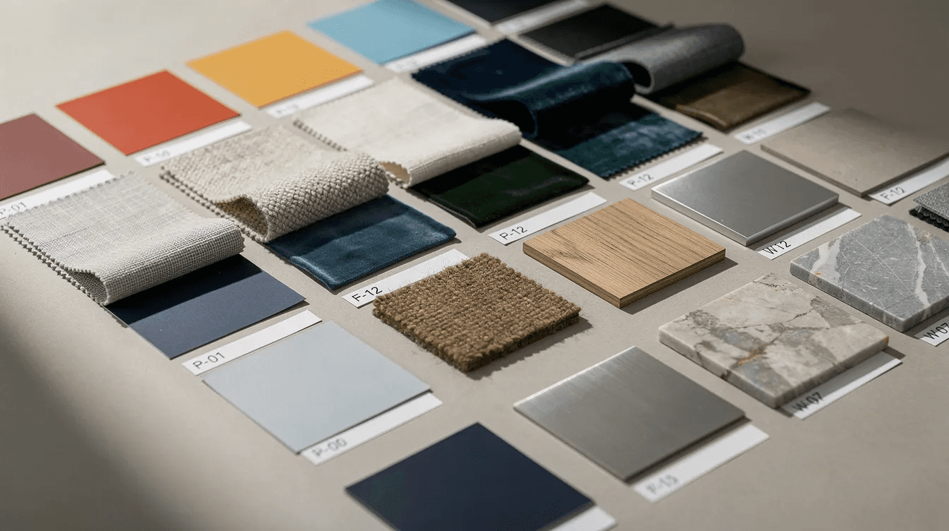
Cross-Cultural Colour Perception in a Multinational City
Dubai isn't just a UAE city-it's a global crossroads. GCC nationals, South Asian communities (Indian, Pakistani, Bangladeshi, Filipino), European professionals, African residents, and East Asian expatriates all interact with your brand. Each group brings different colour associations shaped by their own cultural context.
Consider these examples:
White signals purity and cleanliness in most Western and Middle Eastern cultures, but in some East Asian contexts, it's associated with mourning. A wellness brand targeting both Emirati families and Chinese tourists needs to account for this difference.
Yellow and gold are auspicious in many South Asian and Chinese cultures, conveying prosperity and celebration. In Western UI conventions, yellow often signals caution or warnings. If your app serves both audiences, you need to be deliberate about where and how yellow appears.
Red is celebratory in Chinese culture and energetic in Western marketing, but it can carry aggressive or alarming connotations in formal Gulf settings when used dominantly.
This is where a design agency in Dubai adds value beyond aesthetics. Agencies working across diverse audiences typically run:
Stakeholder interviews with representatives from key demographic segments to surface colour preferences and aversions before finalizing palettes.
A/B testing on digital platforms, comparing colour variants across user groups to see which combinations drive higher engagement among specific demographics.
User testing with bilingual interfaces, checking that colour contrast works in both Arabic (RTL) and English (LTR) layouts, where different text lengths and script densities can shift the visual balance of a page.
Surveys and focus groups with GCC nationals and expatriate communities to validate that the target audience responds positively to proposed palettes.
These methods ensure colour strategy is grounded in evidence rather than assumptions. In a city where your customer base spans 200+ nationalities, skipping this step is a risk most brands can't afford.
Colour Strategy Across Digital Marketing Channels
Colour strategy doesn't stop at the brand guidelines PDF. It extends into every digital marketing output-Instagram grids, LinkedIn creatives, performance ads, landing pages, email campaigns, and social media marketing assets. Each channel has its own visual context, and your colours need to perform in all of them.
Agencies working in Dubai typically define what's called a "campaign palette"-a curated subset of the master brand palette, optimized for specific marketing strategies and seasonal pushes. This keeps performance creatives on-brand while allowing enough flexibility to optimize for clicks and conversions.
Here's a realistic scenario:
A Dubai retail brand running a Ramadan sale campaign shifts its creative palette to deeper greens, gold accents, and night-sky blues-colours that resonate with the season. But the core brand colour (say, a signature coral) still appears in the logo lockup and CTA buttons, maintaining recognition.
Instagram stories use high-contrast versions of the campaign palette because stories are viewed quickly and on small screens. Carousel posts get slightly muted tones that feel editorial and encourage swipes.
Performance ads on Google Display and Meta use the campaign palette with one key constraint: CTA buttons are tested in two or three colours to see which drives higher click-through rates among UAE audiences. Often, a high-contrast accent colour outperforms a brand-matched button.
Practical colour considerations for digital marketing in Dubai:
Background-to-product contrast matters more than colour preference. Products shot against a colour that's too similar get scrolled past.
Email campaigns sent to UAE inboxes often render differently across Outlook (common in corporate settings) and Gmail. Test colour rendering in both.
LinkedIn creatives targeting DIFC professionals benefit from muted, confident palettes. The same brand targeting Mall of the Emirates shoppers on Instagram can go bolder.
Lead generation landing pages should use colour to create clear visual hierarchy: one dominant background, one contrasting CTA, and minimal competing colours.
The point is that colour in digital marketing isn't decorative-it's functional, and a design agency with strategic expertise treats it that way.
Web & App UI/UX: Designing for Eyes, Devices, and Desert Light
Dubai's environmental conditions create a specific challenge for digital colour work. A mobile app that looks sharp in an air-conditioned office in DIFC can become nearly unreadable when a user checks it while walking along Dubai Marina in afternoon sunlight. Screen glare, high ambient brightness, and reflective surfaces all reduce perceived contrast.
This is why a design agency calibrates colour tokens for UI with real-world conditions in mind:
Button states (default, hover, pressed, disabled) each need distinct colours that remain distinguishable in bright outdoor conditions. A subtle change from light grey to slightly darker grey won't register on a sun-washed screen.
Success and error states require more than colour alone. A fintech app used daily by customers across Dubai and Sharjah should pair green (successful transfer) with a checkmark icon, and red (failed transaction) with an alert icon-because relying on colour alone excludes colour-blind users.
Dark mode isn't just a design trend-it's a practical preference for many users in the region. Design systems need colour variants for both modes so that brand colours maintain their intended impact regardless of setting.
The Dubai Universal Design Code mandates a reflectance contrast of at least 50 LRV between text and background on signage. For web and app interfaces, the widely adopted standard is a minimum contrast ratio of 4.5:1 for text against its background (WCAG Level AA). Meeting these standards isn't optional for government and healthcare projects, and it's increasingly expected by users across all sectors.
Practical ui ux design guidance for Dubai:
Test your app's screens outdoors, on actual devices, during peak daylight hours. Screenshots in Figma are not enough.
Define colour tokens that include both a "standard" and "high-contrast" variant for key UI elements.
Ensure that interactive elements (links, toggles, sliders) have sufficient colour differentiation from static text and backgrounds.
Build user friendly websites by applying colour to create clear visual paths through complex flows like checkout, KYC onboarding, or appointment booking.

Case Study 1: Colour Strategy for a Dubai Retail Brand
A mid-sized fashion retail chain operating across three locations-Dubai Mall, Mall of the Emirates, and a flagship in City Walk-approached a creative design agency to address a persistent problem: customers didn't recognize them. Despite competitive pricing and a strong product range, brand recall was low. Repeat visits were driven by location convenience, not loyalty.
The root cause became clear during the colour audit. Each store had evolved its own visual approach over time. The Dubai Mall location used warm terracotta tones in its interior, the Mall of the Emirates store leaned into cool greys, and the City Walk flagship used a bright blue accent that appeared nowhere else. The e-commerce site used yet another palette-a generic white-and-black theme with green buttons lifted from a template. Social media posts alternated between whatever the content creator preferred that week.
The agency's process:
A comprehensive competitor review mapped the colour palettes of twelve comparable fashion brands in Dubai. The analysis revealed that most competitors clustered around black, white, and a single accent-meaning differentiation was achievable with a more distinctive palette.
Customer surveys across 400 respondents (split between GCC nationals, South Asian residents, and Western expats) identified a preference for warm, confident tones over the clinical cool palettes that dominated competitors.
The agency developed a primary palette of deep burgundy, warm sand, and off-white, with charcoal as the anchor neutral. A metallic copper accent served as the signature colour for CTAs, shopping bags, and loyalty card elements.
Deployment covered updated in-store signage, e-commerce UI, social media templates, in-store wayfinding, and seasonal campaign frameworks for Ramadan, Dubai Shopping Festival, and summer sales.
The results over nine months:
Unprompted brand recognition in exit surveys increased from 12% to 34%.
Online conversion rate on the e-commerce site improved by 18%, attributed partly to clearer visual hierarchy and stronger CTA contrast.
Instagram engagement rate grew by 27% as the consistent visual identity made the grid recognizable in feeds.
Positive feedback from store managers noted that customers increasingly referenced "the burgundy store" when giving directions to friends-a sign of colour-driven recall.
This case illustrates why graphic design services alone aren't enough. The colour strategy provided the foundation that made all other creative design solutions more effective.
Case Study 2: Colour Strategy for a Dubai Fintech or Banking Brand
A digital banking platform serving SMEs across UAE free zones needed a design overhaul. The app had launched two years earlier with a generic blue-and-white palette and minimal UI consideration. As the user base grew past 15,000 active accounts, problems surfaced. Support tickets related to "confusing screens" accounted for 22% of all inbound queries. Users reported difficulty distinguishing between pending and completed transactions. The onboarding flow had a 40% drop-off rate at the KYC document upload stage.
The platform engaged a creative partner with experience in fintech and banking UI to redesign the colour system alongside the interface.
The agency's approach:
A colour audit of the existing app revealed that three different blues were used inconsistently across screens, alert colours clashed with the brand palette, and the KYC flow used red progress indicators that users interpreted as errors rather than required steps.
Competitor benchmarking across eight regional banking and fintech apps established that blues and greens dominated, but most competitors used them without systematic hierarchy.
The new palette retained blue as the trust anchor but introduced a structured system: a deep navy for headers and navigation, a lighter blue for informational panels, and teal as a secondary colour for account overview highlights.
Success states used a distinct green with a checkmark icon. Error states paired red-orange with an alert triangle. Pending states used amber with a clock icon-ensuring users could distinguish states by colour and shape.
The KYC onboarding flow was redesigned with a green progress bar that filled incrementally, replacing the previous red step indicators. Each completed step turned from grey to green, reinforcing progress.
The brand guidelines documented every colour decision with specific rationale, accessibility compliance data, and usage rules for web development and mobile implementations.
Measurable improvements within six months:
Support tickets related to UI confusion dropped by 38%.
KYC onboarding completion rate increased from 60% to 79%.
App Store rating in the UAE improved from 3.4 to 4.1 stars, with several reviews specifically mentioning the "cleaner" and "easier to read" interface.
The design led approach to colour reduced cognitive load and directly supported business growth by retaining more users through onboarding.
This case demonstrates how colour isn't cosmetic in fintech-it's functional infrastructure that impacts revenue and user trust.
Colour Systems, Design Tokens, and Custom Software Development
Modern design agencies in Dubai have moved well beyond handing over a PDF with six hex codes. Today, the deliverable is a fully documented colour system with design tokens that integrate directly into custom software development workflows.
Here's what that looks like in practice:
Design tokens are named variables (e.g., color-primary-500, color-error-default, color-surface-dark) that store colour values in formats usable by both designers and developers. They're exported from tools like Figma and delivered as JSON, CSS variables, or platform-specific formats.
When a web development team builds a website, they reference these tokens rather than hard-coding hex values. If the brand's primary blue changes from #1A3F6B to #1E4578, updating the token updates every instance across the product automatically.
This approach ensures cohesion across websites, mobile apps, kiosks in Dubai malls, and digital signage at locations like Dubai Airport or Dubai Metro stations.
The collaboration between design and engineering teams matters:
The design agency defines the colour system with all variants: light mode, dark mode, high-contrast mode, and print-specific values (Pantone, CMYK).
Mobile app development teams receive platform-specific tokens (iOS and Android) so that colours render identically across devices.
Web teams receive CSS custom properties or tokens compatible with their framework (React, Vue, etc.).
Digital signage and kiosk teams receive calibrated values that account for screen brightness and ambient lighting in mall environments.
A robust colour system reduces development time and bugs. When a developer doesn't have to guess which shade of green to use for a success message, they build faster and with fewer inconsistencies. This contributes to cost effective outcomes over the lifetime of a digital product, particularly for brands operating across multiple digital solutions and physical locations.
The investment in tokens and documentation is what separates a one-time graphic design project from a scalable system that supports long-term brand engagement and growth.
Physical vs Digital: Integrating Colour in Spaces and Screens
Agencies working in Dubai regularly face a challenge that purely digital agencies elsewhere rarely encounter: the same brand must look consistent across a flagship store in The Dubai Mall, a stand at GITEX Global at Dubai World Trade Centre, an installation in Dubai Design District (d3), and a website viewed on a phone in Deira.
The gap between digital and physical colour is real. A hex code that looks perfect on a calibrated monitor can appear completely different when printed on vinyl signage, painted on a wall, or displayed on an outdoor LED screen. Dubai's strong sunlight compounds this-colours that feel vibrant indoors can wash out entirely on an exterior façade.
Practical considerations for integrating colour across environments:
Metallic finishes (gold foils, copper laminates) reflect light differently under mall LED lighting versus natural daylight. Agencies prototype physical samples and review them in the actual installation environment before committing to production.
Print materials (business cards, brochures, event collateral) need CMYK and Pantone specifications alongside RGB/hex values. A colour that's achievable on screen may fall outside the printable gamut, requiring a close substitute.
Environmental graphics and wayfinding signage must meet the Dubai Universal Design Code's reflectance contrast requirements. This means testing not just colour appearance but measurable lightness contrast between text and background surfaces.
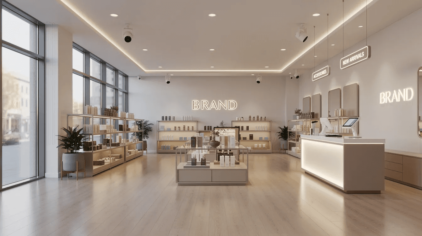
Interior design elements-wall colours, furniture upholstery, lighting gels-interact with brand colours. A deep navy wall can make a gold logo look luxurious, while a warm beige wall might make the same gold look muddy.
Agencies that deliver projects across physical and digital touchpoints typically create a colour specification document that includes swatches for every medium: screen, print, paint, fabric, and signage substrate. This level of documentation prevents the gradual drift that happens when vendors and contractors interpret brand colours independently.
Cost-Effective Outcomes: Getting ROI from Colour Strategy
One of the most common objections to investing in professional colour strategy is cost. But the real expense is doing it wrong-or doing it piecemeal.
Consider a Dubai SME that updates its Instagram colours every quarter based on trending palettes, redesigns its website every 18 months because the last version "feels dated," and reprints business cards whenever a team member decides the blue isn't quite right. Each change costs money, fragments brand recognition, and resets customer familiarity to zero.
A structured colour strategy eliminates this cycle. Here's how it translates to measurable outcomes:
Higher conversion rates: clear visual hierarchy with properly contrasted CTAs guides users toward desired actions. Even a 2-3% improvement in conversion rate on a high-traffic Dubai e-commerce site can translate to significant revenue.
Reduced bounce rate: pages with cohesive, professional colour palettes retain visitors longer. Cluttered or clashing colour schemes signal low credibility and trigger exits.
Improved in-store navigation: consistent colour-coded wayfinding in retail environments reduces customer frustration and increases dwell time.
Stronger brand recall: when customers see consistent colours across your billboard, your Instagram ad, and your storefront, each exposure reinforces the previous one. This compound effect reduces the cost per impression needed to maintain awareness.
Phased rollout is a practical budget strategy:
Start with digital touchpoints (website, social media templates, ad creatives) in the first phase. These are fastest to update and have the highest daily impression volume.
Roll out physical touchpoints (signage, stationery, packaging) in the second phase, aligned with existing reprint or renovation schedules.
This approach spreads the budget over two to three quarters while maintaining visual coherence from the first update onward.
The cost of a comprehensive colour strategy is a fraction of the cumulative cost of ad-hoc design decisions made without one. A design agency that builds your colour system once, properly, saves you from redesigning everything twice.
Process: How a Dubai Design Agency Builds Your Colour Strategy
Understanding the process removes uncertainty. Here's the typical step-by-step approach that a full service design agency follows when developing colour strategy for Dubai businesses, along with realistic timeframes.
Discovery and sector research (Week 1–2): The agency audits your current colour usage across all touchpoints. They map competitors in your sector within Dubai and the wider GCC, identifying colour patterns and white space. Cultural context research covers UAE colour symbolism, audience demographics, and regulatory requirements. This phase also includes stakeholder interviews to understand internal preferences and constraints.
Brand positioning and target audience definition (Week 2–3): Based on discovery findings, the agency clarifies your brand's desired position in the market. They define which audience segments matter most and what emotional and cultural associations your colours should carry. This is where brand strategy meets colour psychology.
Palette exploration and colour psychology workshops (Week 3–4): The agency presents multiple palette directions, typically three to five options, each supported by rationale tied to positioning and cultural insights. Workshops with your team allow for informed discussion rather than subjective debates. Creative concepts at this stage include moodboards showing how each palette would appear across key applications.
Prototyping across touchpoints (Week 4–6): Selected palette directions are prototyped across realistic use cases-homepage designs, app dashboard screens, Instagram post templates, OOH billboard concepts, and physical signage mockups. This is where you see colour in context rather than in isolation.
Testing and refinement (Week 5–7): Prototypes are tested with stakeholder groups and, where possible, with representative users from your target audience. A/B testing on digital platforms provides data on which colour combinations drive engagement. Accessibility audits verify contrast ratios and colour-blind compatibility.
Documentation in brand guidelines and design systems (Week 6–8): The final palette is locked into comprehensive services documentation: hex/RGB values, CMYK/Pantone equivalents, design tokens for developers, usage rules, minimum sizes, and do/don't examples for seasonal campaigns. This becomes the living reference for your creative teams and external vendors.
A compact sprint can deliver initial colour direction in two to three weeks. A full brand identity system with colour, typography, imagery, and digital rollout typically takes six to eight weeks. Complex multi-market ecosystems (UAE plus Saudi Arabia plus Qatar) may extend to three to six months.
The key throughout is that project management keeps the process on track with clear milestones, smooth communication between stakeholders, and defined approval gates that prevent scope creep without compromising quality.
Brand Guidelines: Locking in Colour Consistency
Your colour strategy is only as good as the documentation that preserves it. Brand guidelines are the operational manual that ensures your colours stay consistent as your brand scales across teams, vendors, and markets.
A modern brand guideline document for a Dubai-focused business includes:
Exact colour specifications: hex codes for digital, RGB values for screen, CMYK values for print, and Pantone references for specialty printing and merchandise.
Contrast rules: minimum acceptable contrast ratios for text over coloured backgrounds, specified for both light and dark modes.
Minimum usage sizes: the smallest dimensions at which coloured elements (logos, icons, colour blocks) may appear before legibility degrades.
Do/don't examples: concrete visual demonstrations showing correct colour application alongside common mistakes. These are particularly useful for seasonal campaigns like Ramadan, UAE National Day, and Dubai Shopping Festival, where temporary colour additions must integrate with-not override-the core palette.
Coverage should span all contexts:
Online: website, mobile apps, social media templates, email signatures, digital ads, and web design services deliverables.
Offline: signage, stationery, OOH advertising, vehicle wraps, event booths, and retail interiors.
Internal: presentation templates, report covers, employee communications, and onboarding materials.
Guidelines also serve a governance function. They prevent ad-hoc colour changes by vendors, franchisees, and internal teams-a common problem for brands expanding across the UAE and Saudi Arabia. When a franchisee in Abu Dhabi decides to "brighten up" their storefront, guidelines provide a clear reference for what's acceptable and what isn't.
A strong branding agency in Dubai will create both a comprehensive PDF or online document and editable templates for designers and marketers. Some agencies now deliver interactive digital brand portals where teams can download approved assets and check colour specifications in real time, reducing the back-and-forth that slows down creative production.
Digital Accessibility and Regulatory Expectations in the UAE
The UAE has moved beyond treating digital accessibility as optional. The National Digital Accessibility Policy, updated in May 2025, requires both governmental and private digital services to support people of determination-including those with visual impairments. Colour is directly relevant.
The practical implications for businesses:
Colour contrast between text and background must meet a minimum ratio of 4.5:1 (WCAG Level AA). This applies to websites, apps, kiosks, and any digital interface a customer or resident interacts with.
The MoHRE digital content policy requires high-contrast colours and fonts for readability, plus support for colour-blind users through multiple colour alternatives and non-colour indicators.
Colour alone should never be the sole indicator of meaning. Error messages need icons or text labels alongside red highlights. Success confirmations need checkmarks or text alongside green.
A realistic example: a government healthcare appointment portal used by residents across all age groups and abilities. If the "confirm appointment" button is a soft green on a light background, it may fail contrast requirements and be functionally invisible to users with low vision. A design agency audits these interfaces, recommends specific colour adjustments, and validates compliance-all while keeping the brand palette intact.
For businesses in various sectors that work with government contracts, serve regulated industries, or simply want to maintain high quality standards, accessibility compliance is a baseline expectation. Agencies with a deep understanding of both UAE regulations and global accessibility standards can navigate this without sacrificing brand aesthetics-delivering creative excellence within necessary constraints.
Seasonal and Cultural Campaigns: Colour for Ramadan, National Day, and Peak Tourism
Dubai's calendar is punctuated by events that demand visual adaptation: Ramadan and Eid, UAE National Day on December 2nd, Flag Day, Dubai Shopping Festival, Dubai Summer Surprises, and New Year celebrations at Burj Khalifa. Each carries its own colour expectations, and brands that respond thoughtfully earn attention and trust.
How agencies approach seasonal colour:
Ramadan campaigns typically shift toward deeper greens, crescent-moon golds, and rich night-sky blues. These colours evoke the spiritual and communal atmosphere of the month. A hospitality brand promoting Iftar packages might layer these seasonal colours over its standard palette, using the seasonal tones for backgrounds and imagery while keeping the core brand colour on logos and CTAs.
UAE National Day campaigns draw on the flag's red, green, white, and black. But simply slapping flag colours on everything isn't strategy-it's decoration. Effective campaigns weave these colours into the brand's existing system, perhaps using green as a temporary accent or incorporating red as a border element, while maintaining the brand's own dominant colour for recognition.
Dubai Shopping Festival and summer campaigns allow more creative freedom. Bright, energetic palettes work well for retail promotions, but agencies ensure these stay within a defined "extended palette" documented in the brand guidelines rather than improvised by individual designers.
The key principle is pre-planning:
Seasonal colour variations should be designed in advance as part of the brand system, not created as one-off responses to each campaign brief.
Templates for social media, email, and in-store signage should include seasonal colour swap options that have been pre-approved and tested for contrast and readability.
Agencies often create a "seasonal colour appendix" within brand guidelines, specifying which core colours remain constant, which can be temporarily supplemented, and which seasonal colours are approved for use.
This approach lets brands participate in cultural moments authentically without diluting their core visual identity. It also means creative teams can execute seasonal campaigns faster because the colour decisions have already been made.

Fresh Perspectives: How International Expertise Enhances Local Colour Strategy
Dubai's design ecosystem benefits from a distinctive blend: agencies often combine international experience from the EU, US, and Asia with deep local culture knowledge. This fusion produces fresh perspectives that neither purely local nor purely international studios can match alone.
Here's why this matters for colour strategy:
International experience helps agencies spot global trends early-neo-brutalism, muted gradients, dynamic dark mode patterns-and evaluate which ones translate to Dubai's context. Not every trend works here. The muted, desaturated palettes popular in Scandinavian design can feel lifeless in Dubai's vibrant visual environment. An agency with global exposure knows when to adopt and when to adapt.
Agencies with cross-market portfolios bring benchmarking data from sectors where international standards matter. A fintech brand in Dubai competing globally needs colour language that resonates with Silicon Valley investors and Abu Dhabi regulators simultaneously. A premium hospitality brand needs to look credible to European travellers and appealing to GCC guests.
Dedicated teams with diverse backgrounds naturally bring wider colour associations into workshops. A designer who's worked on healthcare branding in London and retail in Singapore brings pattern recognition that a purely local team might lack.
But fresh perspectives don't mean importing design blindly:
Global trends must be filtered through local cultural norms. A neon-heavy palette that works for a Berlin tech brand may feel out of place on a Dubai government service portal.
Regulatory requirements are UAE-specific and must be respected regardless of where an agency draws inspiration.
Creative teams that blend international and local talent can deliver innovative solutions that feel contemporary without losing cultural authenticity.
The best design agency in Dubai is one that draws from the world but designs for this market-using global knowledge to elevate local colour strategy rather than replace it.
Evaluating a Design Agency in Dubai for Colour Strategy Expertise
Not every graphic design agency has the strategic depth to handle colour properly. Here's a practical checklist for businesses seeking a creative partner with genuine colour strategy capabilities.
Portfolio review:
Look for consistent, intentional use of colour across projects, not just attractive visuals. Can you identify a clear colour rationale in their case studies, or does each project feel randomly coloured?
Check whether their portfolio spans various industries-real estate, fintech, hospitality, healthcare-showing adaptability rather than a single aesthetic.
Look for evidence that visuals resonate across both digital and physical applications. A strong portfolio shows web design, mobile interfaces, signage, and environmental graphics unified by coherent colour systems.
Process and methodology:
Ask whether they conduct cultural and competitive colour research as part of their process, or whether they jump straight to visual exploration.
Check if their design services include accessibility audits with documented contrast ratios and colour-blind testing.
Verify that they can work across Arabic and English interfaces, including RTL/LTR layout considerations that affect colour balance and readability.
Confirm their experience coordinating colour across digital marketing, product UI, and physical environments-not just one channel.
Case studies and evidence:
Request case studies that mention measurable outcomes linked to colour decisions: conversion improvements, engagement rates, user satisfaction scores, or garnered positive feedback from stakeholders.
Ask for examples of brand guidelines they've produced and how those guidelines handle seasonal campaigns, dark mode, and multi-market applications.
Questions to ask in a discovery call:
"How do you handle cultural colour nuances when a brand serves both GCC nationals and Western expatriates?"
"What's your process for testing colour across devices and real-world environments in Dubai?"
"How do you manage colour rollouts for brands operating across UAE and Saudi Arabia?"
"Can you show me how you've documented colour systems as design tokens for development teams?"
A transparent process, realistic timelines, and a willingness to explain their strategic insights are the marks of an agency that treats colour as strategy, not decoration.
Pricing and Timelines: What Dubai Businesses Should Expect
Colour strategy and branding projects in Dubai span a wide range depending on scope, complexity, and the number of touchpoints involved. Here are realistic ranges as of 2025–2026.
Project types and indicative pricing (USD):
Colour refresh with updated brand guidelines: $5,000–$15,000. This covers a colour audit, revised palette, contrast testing, and documented guidelines. Suitable for brands that have a strong identity but need to modernize or fix inconsistencies.
Full brand identity system including colour, typography, imagery, and logo design: $15,000–$50,000. Includes discovery, strategic positioning, palette development, prototyping across key touchpoints, and comprehensive brand guidelines. The project scope and number of stakeholder rounds influence where you land in this range.
Brand identity plus website or product UI overhaul: $35,000–$100,000+. Combines brand strategy with web design or app interface redesign, including colour system implementation via design tokens, responsive prototyping, and development handover.
Typical timelines:
Compact colour sprint: 2–3 weeks for focused palette development and documentation.
Full brand identity project: 6–10 weeks from discovery to final guideline delivery.
Complex multi-market brand ecosystem (UAE, Saudi, Qatar, with digital and physical rollout): 3–6 months.
Factors that increase cost:
More touchpoints (multiple apps, websites, physical locations, event collateral) require more colour testing and documentation.
Custom software development integration, where design tokens need to be implemented across proprietary platforms, adds engineering coordination time.
Regulatory requirements for government or healthcare projects require additional accessibility audits and documentation.
Multiple stakeholder approval layers extend timelines and increase revision cycles.
Factors that decrease cost:
Clear brand positioning and existing strategic inputs reduce discovery time.
A focused project scope (colour only, no logo or typography changes) keeps the work lean.
Decisive stakeholder groups that can approve within defined review windows prevent timeline inflation.
The consistent pattern is that investing upfront in strategic colour work avoids more expensive rework later-when signage has already been printed, apps have already been coded, and campaigns have already launched with the wrong palette.
Working With a Dubai Design Agency: From Discovery Call to Launch
Understanding the collaboration journey helps you set expectations and get better results. Here's what a typical engagement looks like from the first conversation to final delivery.
Discovery call (Day 1): The conversation focuses on your business goals, sector specifics, current brand situation, and what's driving the need for colour strategy work. A good agency asks about your competitive landscape, customer demographics, and existing pain points before discussing design. Expect this call to last 45–60 minutes.
Strategy workshops and moodboards (Week 1–2): The agency presents initial research findings: competitive colour mapping, cultural considerations, and strategic insights about your sector in Dubai. Moodboards translate abstract strategy into visual directions. You'll typically see three to five directions, each with a colour palette, typography pairing, and sample imagery. Your feedback here is critical-be specific about what resonates and what doesn't.
Prototyping key use cases (Week 2–4): Based on the approved direction, the agency prototypes realistic applications-a homepage concept, an app dashboard screen, an Instagram post series, and possibly an OOH billboard or signage concept. This is where colour moves from theory to practice. You see how your palette works in the environments where customers will actually encounter it.
Feedback loops and approvals (Week 3–5): Expect two to three structured feedback rounds. The agency refines prototypes based on your input, adjusting colour balance, contrast, and application details. High quality work comes from honest, specific feedback-"the blue feels too corporate" is more useful than "I don't like it."
Final delivery and handover (Week 5–8): You receive final design files, colour specifications (hex, RGB, CMYK, Pantone), design tokens for development teams, brand guidelines, and editable templates. A thorough agency also provides a handover session where they walk your team through the system, explaining the rationale behind each decision.
Expectations on both sides:
You provide timely feedback (within 2–3 business days per round), access to brand data and stakeholders, and honest input about preferences and constraints.
The agency provides transparent progress updates, sticks to agreed timelines, and flags risks early. Smooth communication throughout is what separates a productive engagement from a frustrating one.
This structured process ensures that by the time you launch, your colour strategy has been researched, tested, refined, and documented-not just designed.
Colour Strategy Mistakes Dubai Businesses Should Avoid
Even well-intentioned brands make colour mistakes that cost money and erode trust. Here are the most common pitfalls a design agency in Dubai encounters, along with prevention tips.
Choosing colours based on personal preference without user validation. A CEO who loves purple doesn't mean their fintech app should be purple. Fix: always validate palette choices with target audience research-surveys, A/B tests, or focus groups with representative demographics.
Overusing national colours year-round. Wrapping your brand in red, green, white, and black every day dilutes differentiation-your brand starts looking like a permanent National Day campaign. Fix: reserve national colours for seasonal campaigns and use your distinctive brand palette the rest of the year.
Poor contrast in mobile interfaces used outdoors. A tourist-focused booking site with light grey text over desert imagery is unreadable on a phone screen at Jumeirah Beach. Fix: test all critical interfaces on actual devices in outdoor conditions, and maintain at least 4.5:1 contrast ratios for body text.
Inconsistent colours across franchise locations, websites, and social media. When your Dubai Marina branch uses a different shade of blue than your website, and your social media uses a third variant, you fragment recognition. Fix: centralize colour decisions in documented brand guidelines with exact specifications, and enforce them across all vendors.
Ignoring how colour renders across different materials. A brand colour that's vibrant on screen can look dull on matte paper or shift hue on vinyl signage. Fix: specify colour values for each medium (screen, print, signage, fabric) and prototype physical samples before mass production.
Using colour trends without context. A gradient that looks stunning on a Behance portfolio might feel disorienting in a healthcare patient portal. Fix: evaluate trends against your sector's expectations and your users' needs, not against design awards.
Failing to account for bilingual layouts. A colour scheme that works beautifully with English headings may create unexpected visual imbalances when Arabic text (which is denser and reads right-to-left) is applied. Fix: prototype all colour applications in both languages and both reading directions.
Future Trends: AI, Data, and the Next Wave of Colour Strategy in Dubai
Colour strategy in Dubai is entering a data-driven era. Here's what's emerging and where it's heading through 2027.
AI-driven colour testing:
Multivariate testing tools now allow agencies to test dozens of colour combinations simultaneously across digital campaigns targeting UAE users. Instead of A/B testing two CTA button colours, agencies can test fifteen variations across audience segments and let algorithms identify winners within days.
Heatmap and eye-tracking analysis, increasingly used by Dubai agencies, shows exactly where users look on a page and how colour influences attention distribution. These strategic insights inform not just colour choices but colour placement.
Generative AI for palette exploration:
AI tools can rapidly generate palette variations based on inputs like "luxury, sustainable, GCC audience, green-dominant." This accelerates the exploration phase of colour strategy, allowing creative teams to consider a wider range of options before narrowing down.
However, AI-generated palettes still require human oversight. Algorithms don't understand UAE cultural nuances-they don't know that a particular shade of green is associated with a competitor, or that a gold that works on screen will look cheap on vinyl. Human judgment remains essential.
Personalization and dynamic colour:
Some mobile apps are beginning to experiment with personalized colour themes-allowing users to select preferred accent colours or automatically adjusting colour temperature based on time of day. For Dubai users moving between bright outdoor environments and air-conditioned interiors, adaptive colour could improve readability and engagement.
Dynamic colour in digital advertising (where ad creatives automatically adjust palette based on viewer demographics or platform context) is still emerging but expected to become standard for performance campaigns by 2027.
AEO and AI search visibility:
While Answer Engine Optimization and AI-driven search results primarily affect text and structure, colour still heavily influences human response once a user lands on your content. High quality visuals with strategic colour draw engagement that AI summaries cannot replicate.
The future of colour strategy in Dubai will combine human cultural intelligence with machine-scale testing-agencies that master both will deliver innovative solutions that neither humans nor algorithms could achieve alone.
Frequently Asked Questions About Colour Strategy and Design Agencies in Dubai
Why can't my in-house team just pick brand colours without an agency? They can, but the risk is high. Colour decisions that feel right internally often fail with actual customers. An agency brings competitive research, cultural knowledge, accessibility compliance, and testing infrastructure that in-house teams typically lack. In Dubai's multicultural environment, getting colour wrong means alienating segments of your diverse audiences without realizing it.
How long does it take to update colours across my website and social media in Dubai? If you have a documented colour system with design tokens and templates, a web and social media colour update can be executed in one to two weeks. Without that foundation, expect four to six weeks for the colour refresh, template redesign, and QA across platforms. The timeline depends on whether you need web development changes or just template swaps.
Do I need different colour strategies for Dubai vs Saudi Arabia or Qatar? Not necessarily different strategies, but you need regional adaptations. Cultural colour associations overlap across the GCC but aren't identical. A colour that signals luxury in Dubai may carry different weight in Riyadh. Agencies experienced in the middle east build flexible colour systems that maintain brand coherence while allowing regional nuance.
Can a branding agency in Dubai fix my existing colours without a full rebrand? Yes. A colour refresh is one of the most common and cost-effective engagements. It involves auditing your current palette, identifying issues (inconsistency, poor contrast, cultural misalignment), and updating specifications without changing your logo, name, or brand architecture. This targeted approach delivers high quality results without the disruption of a full rebrand.
How do you test whether colours are working for my target audience? Agencies use A/B testing on digital platforms, user surveys with segmented demographic groups, heatmap analysis, and sometimes eye-tracking studies. For physical touchpoints, prototype reviews under real lighting conditions (including Dubai's outdoor sunlight) validate colour performance. The goal is data-driven validation, not opinion-based decisions.
What if my brand has to comply with strict global guidelines? Many international brands operating in Dubai face this. A skilled agency works within your global brand guidelines while identifying areas of flexibility-seasonal campaign palettes, local market adaptations, and digital-specific variations that global guidelines often leave room for. They can also make a case to your global team for region-specific adjustments supported by local market data.
Is colour strategy relevant for B2B companies in Dubai, not just consumer brands? Absolutely. B2B companies in DIFC, Dubai Internet City, and free zones across the emirate compete for attention in proposals, pitch decks, trade show booths, and LinkedIn feeds. A strong brand with intentional colour use signals professionalism and builds trust with corporate buyers across various sectors just as effectively as it does with consumers.
Conclusion: Building a Colour-Led Brand That Belongs in Dubai
In Dubai's high-velocity, multicultural market, colour is a strategic business tool-not a decorative afterthought. Every shade you choose carries cultural meaning, accessibility implications, competitive positioning weight, and measurable impact on how customers perceive and interact with your brand. The businesses that treat colour with this level of seriousness gain a competitive edge that compounds across every touchpoint, from a billboard on Sheikh Zayed Road to a push notification on a user's phone.
A specialist design agency in Dubai helps align colour choices with your brand identity, digital marketing goals, and customer behaviour. They bring the research, the cultural fluency, the testing infrastructure, and the documentation rigour that turns subjective colour preferences into objective strategic decisions. Whether you're launching a new venture, modernizing a legacy brand, or expanding across the GCC, colour strategy is the foundation that everything else builds on-your digital presence, your physical spaces, your campaigns, and your customer relationships.
Start by auditing your current colour usage across three touchpoints: your website, your social media, and one physical space-your office lobby, your retail store, or your trade show booth. Note where colours are inconsistent, where contrast feels weak, and where your palette blends into competitors rather than standing apart.
Then start a conversation. Not about a full rebrand-just about colour. A focused engagement with a design agency or branding agency in Dubai around colour strategy alone can reveal opportunities and risks you haven't considered. From there, expand into broader creative services as the data and results justify. The strongest brands in Dubai weren't built by accident. They were built by design-and it started with colour.
Why can't my in house team just pick brand colours without an agency?
How long does it take to update colours across my website and social media?
Do I need different colour strategies for Dubai versus Saudi Arabia or Qatar?
Can a branding agency fix my existing colours without a full rebrand?
Is colour strategy relevant for B2B companies, not just consumer brands?


Let’s keep in touch.
Discover more about high-performance web design and online marketing. Follow us on LinkedIn and Instagram.

